- Load the R packages we will use.
- Quiz Questions
- Replace all the instances of ‘SEE QUIZ’. These are inputs from your moodle quiz.
- Replace all the instances of ‘???’. These are answers on your moodle quiz.
- Run all the individual code chunks to make sure the answers in this file correspond with your quiz answers
- After you check all your code chunks run then you can knit it. It won’t knit until the ??? are replaced
- The quiz assumes that you have watched the videos, downloaded (to your examples folder) and worked through the exercises in exercises_slides-73-108.Rmd.
Question: e_charts-1
Create a bar chart that shows the average hours Americans spend on five activities by year. Use the timeline argument to create an animation that will animate through the years.
spend_timecontains 10 years of data on how many hours Americans spend each day on 5 activities- read it into
spend_time
spend_time <- read_csv("https://estanny.com/static/week8/spend_time.csv")
e_chart-1
Start with spend_time
THEN group_by
yearTHEN create an e_chart that assigns
activityto the x-axis and will show activity byyear(the variable that you grouped the data on)THEN use
e_timeline_optsto set autoPlay to TRUETHEN use
e_barto represent the variableavg_hourswith a bar chartTHEN use
e_titleto set the main title to ‘Average hours Americans spend per day on each activity’THEN remove the legend with
e_legend
Question: echarts-2
Create a line chart for the activities that American spend time on.
Start with spend_time
THEN use
mutateto convert year from an number to a string (year-month-day) usingmutate- first convert year to a string “201X-12-31” using the function
paste- paste will paste each year to 12 and 31 (separated by -)
- first convert year to a string “201X-12-31” using the function
THEN use
mutateto convert year from a character object to a date object using theymdfunction from the lubridate package (part of the tidyverse, but not automatically loaded).ymdconverts dates stored as characters to date objects.THEN
group_bythe variable activity (to get a line for each activity)THEN initiate an
e_chartsobject with year on the x-axisTHEN use
e_lineto add a line to the variableavg_hoursTHEN add a tooltip with
e_tooltipTHEN use
e_titleto set the main title to ‘Average hours Americans spend per day on each activity’THEN use
e_legend(top = 40) to move the legend down (from the top)
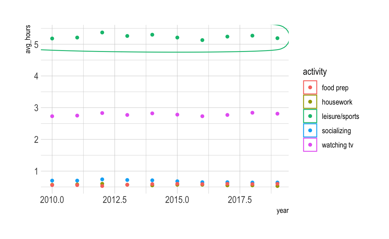
Question: modify slide 82
- Create a plot with the
spend_timedata - assign
yearto the x-axis - assign
avg_hoursto the y-axis - assign
activityto color - ADD points with
geom_point - ADD
geom_mark_ellipse - filter on activity == “leisure/sports”
- description is “Americans spend the most time on leisure/sport”
ggplot(spend_time, aes(x = year, y = avg_hours , color = activity)) +
geom_point() +
geom_mark_ellipse(aes(filter = activity == "leisure/sports",
description= "Americans spend on average more time each day on leisure/sports than the other activities"))
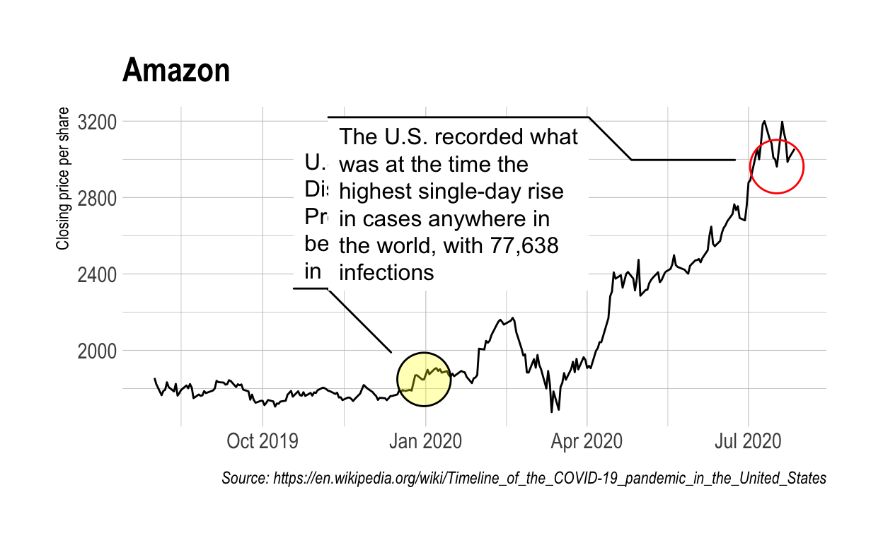
Question: tidyquant
Modify the tidyquant example in the video
Retrieve stock price for Amazon, ticker: AMZN, using tq_get
from 2019-08-01 to 2020-07-28
assign output to
df
df <-tq_get("AMZN", get = "stock.prices",
          from = "2019-08-01", to = "2020-07-28")
Create a plot with the df data
assign
dateto the x-axisassign
closeto the y-axisADD a line with with
geom_lineADD
geom_mark_ellipse- filter on a date to mark. Pick a date after looking at the line plot. Include the date in your Rmd code chunk.
- include a description of something that happened on that date from the pandemic timeline. Include the description in your Rmd code chunk
- fill the ellipse yellow
ADD
geom_mark_ellipse- filter on the date that had the minimum close price. Include the date in your Rmd code chunk.
- include a description of something that happened on that date from the pandemic timeline. Include the description in your Rmd code chunk
- color the ellipse red
ADD
labs- set the title to Amazon
- set x to NULL
- set y to “Closing price per share”
- set caption to “Source: https://en.wikipedia.org/wiki/Timeline_of_the_COVID-19_pandemic_in_the_United_States”
ggplot(df, aes(x = date, y = close)) +
  geom_line() +
  geom_mark_ellipse(aes( filter = date == "2019-12-31", description = "U.S. Centers for Disease Control and Prevention (CDC) became aware of cases in China" ), fill = "yellow", ) +
  geom_mark_ellipse(aes( filter = date == "2020-07-17", description = "The U.S. recorded what was at the time the highest single-day rise in cases anywhere in the world, with 77,638 infections" ), color = "red", ) +
  labs(
    title = "Amazon",
    x = NULL,
    y = "Closing price per share",
    caption = "Source: https://en.wikipedia.org/wiki/Timeline_of_the_COVID-19_pandemic_in_the_United_States")
Save the previous plot to preview.png and add to the yaml chunk at the top
ggsave(filename = "preview.png", path = here::here("_posts", "2021-04-19-data-visualization"))